»»»
UNILEVER / U-STUDIO / FREEZING GOOD
Everybody loves ice cream, but some are vegan, some are cutting back on sugar and some want to enhance their work out. This is the freezer with treats for those who want to enjoy an ice cream that is fitting to their life style choices.
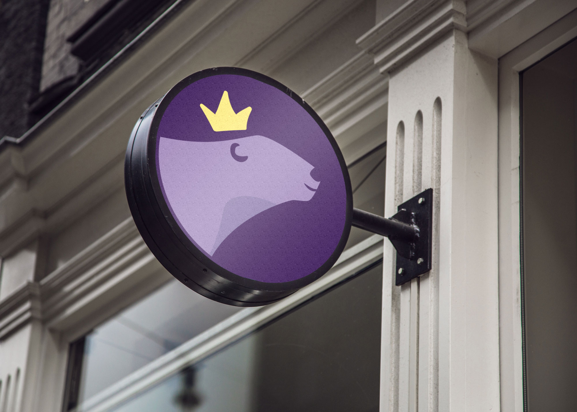
The project to re-design Freezing Good's Logo came with the idea to create a new shape and icon which can live as an extension to the existing shape and colours. Alongside the existing typeface logo, I introduced a memorable pictogram of a hand-drawn polar bear, the King of the Ice, reinforcing Freezing Good as the kingdom of ice cream with benefits.
As our target audience is both health and planet conscious and the polar bear has become the universal symbol for climate change and sustainability, we’re creating a link between the brand and the environmental issues which are important to both the brand and consumers. As the concept leans into sustainability - it fits organically with any future partnerships within this realm. 🐻❄️


